Complex partnership tax data: how user-centered design principles were applied to create interactive and informative dashboards.
Data Analytics
As a UX Lead specializing in data analytics and dashboard building, I collab projects with business analysts and BI developers to create user-centric dashboards for leading FinTech giants: PwC, Deloitte, and RSM. This case study explores the challenges faced by these firms, the collaborative design process, and the impact of the user-centered dashboards.
Tools includes: PowerBI, Tableau, and Qlik
Challenge
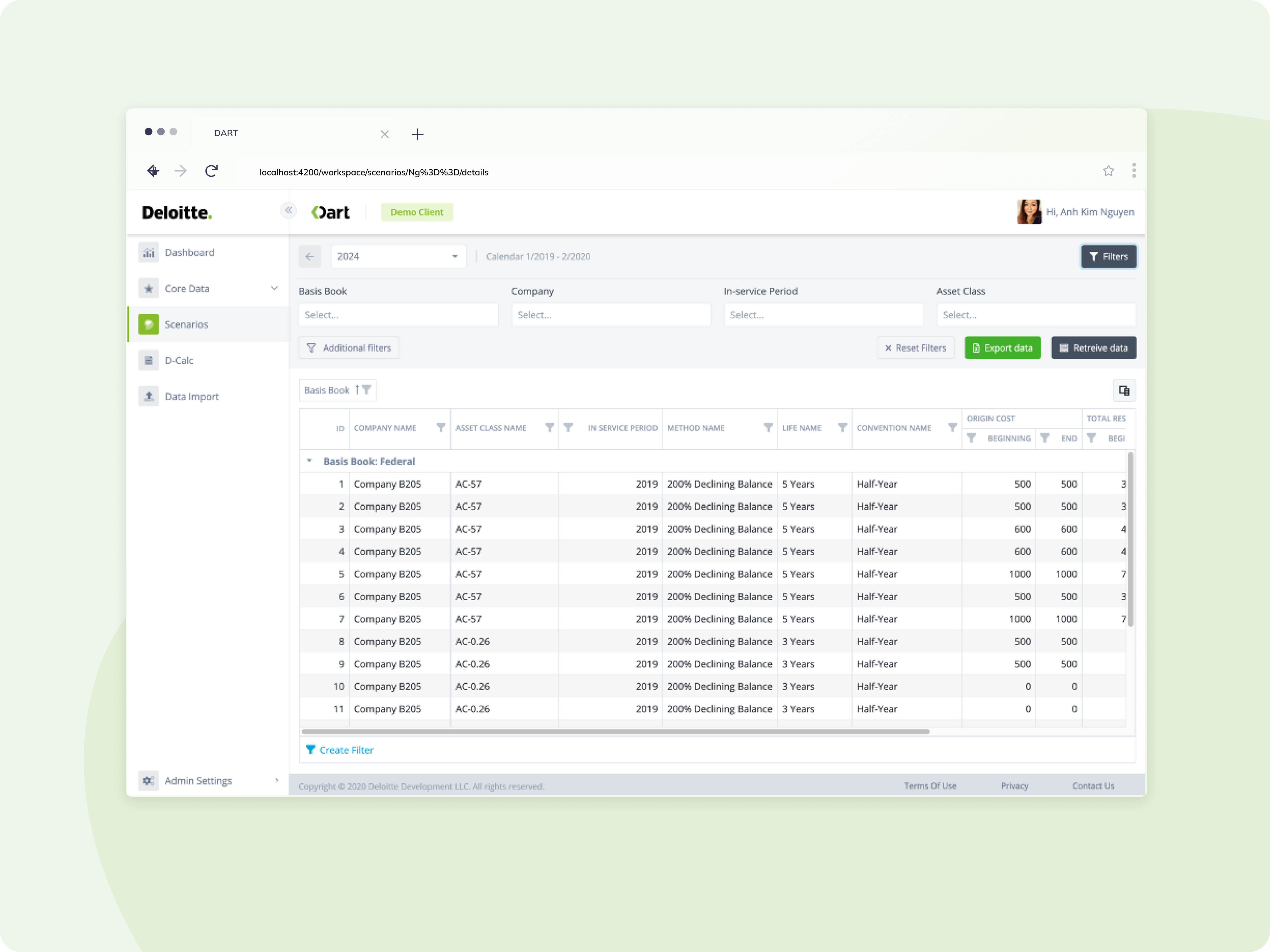
Partnership tax solutions generate vast amounts of complex data. Prior to the custom dashboards, tax professionals at PwC, Deloitte, and RSM relied on:
- Static Reports: Cumbersome static reports hindered efficient data analysis and impeded timely decision-making.
- Disparate Data Sources: Data resided in various systems, requiring manual manipulation and aggregation, leading to inefficiencies and potential errors.
- Limited Customization: Generic dashboards lacked the flexibility to cater to the specific needs and workflows of individual tax professionals.
Solution
We collaborated with business analysts and BI developers to design and implement interactive dashboards tailored to the needs of each firm:
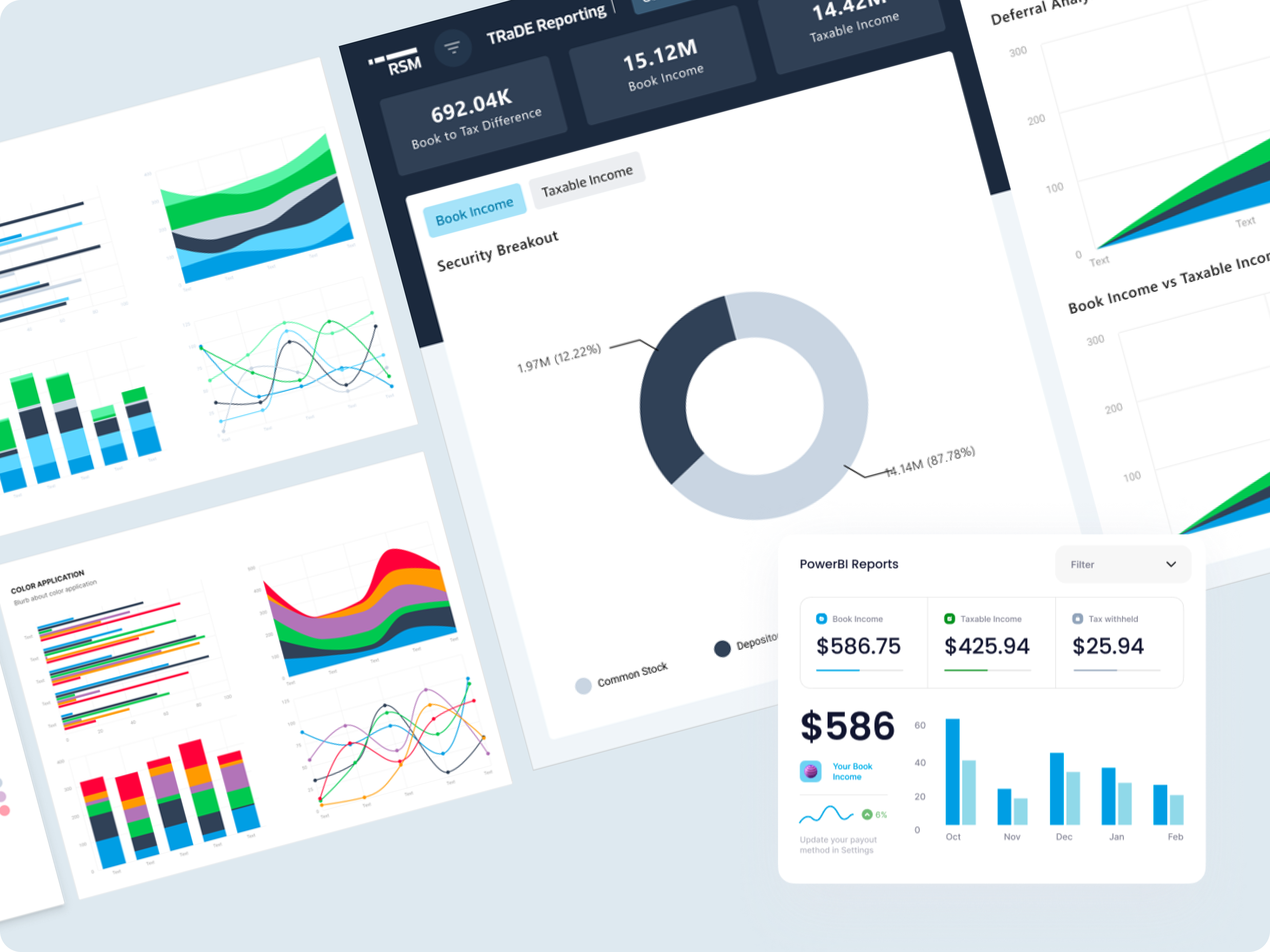
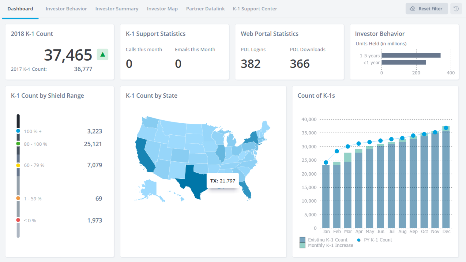
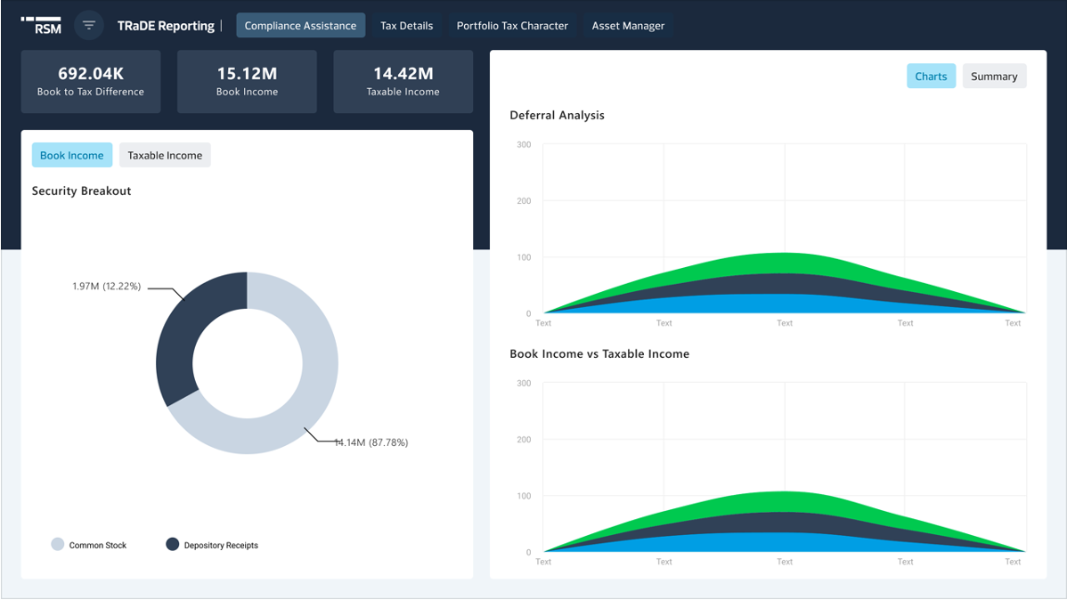
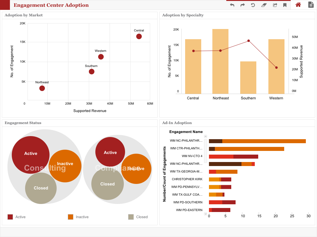
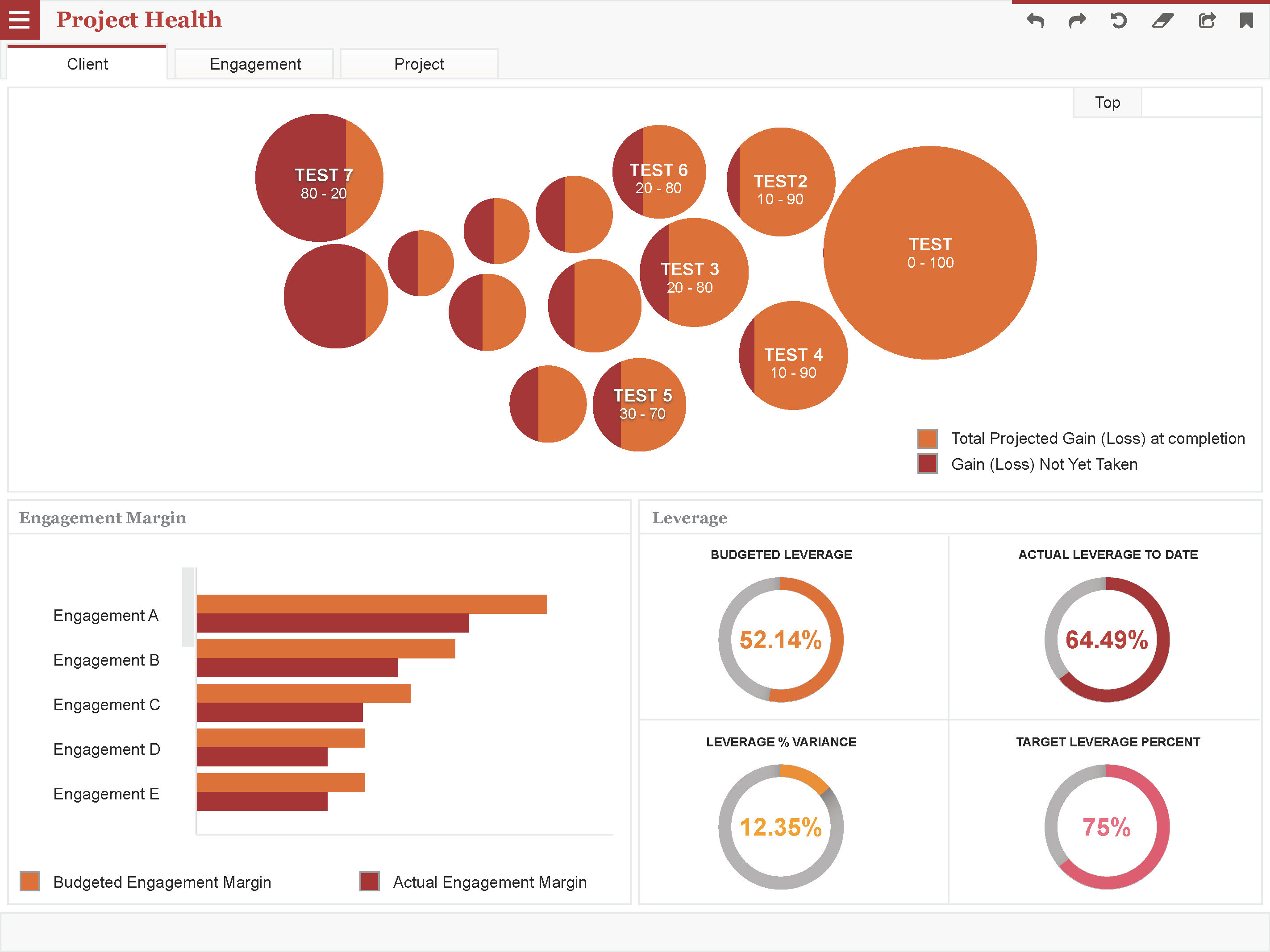
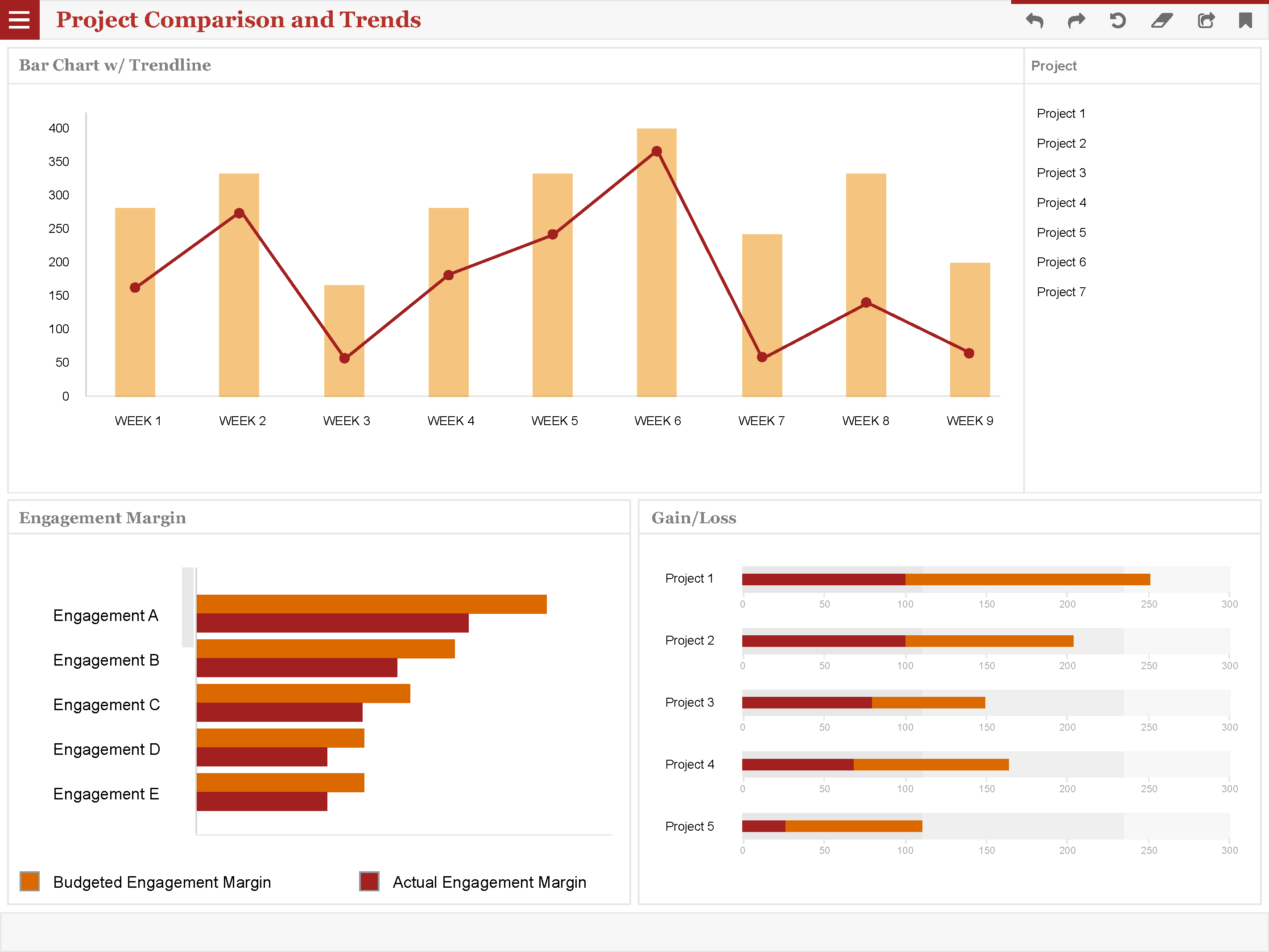
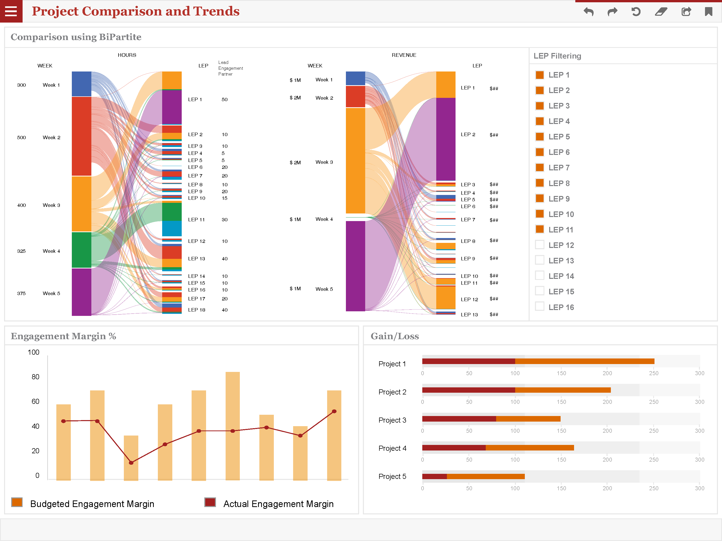
- Interactive Visualizations: Data was presented through compelling and interactive charts, graphs, and tables, enabling tax professionals to easily identify trends and patterns.
- Drill-Down Functionality: Users could delve deeper into specific data points for granular analysis, facilitating informed decision-making.
- Customization Options: Dashboards offered personalized filters and views, allowing tax professionals to tailor the data visualization to their specific project requirements.
Design Process
- Collaborative Workshops: We conducted workshops with tax professionals at PwC, Deloitte, and RSM to understand their data analysis needs, pain points, and preferred information formats.
- Data Exploration and Analysis: Business analysts and BI developers collaborated to define key performance indicators (KPIs) and identify optimal ways to visualize complex data sets.
- User-Centered Design: Prototypes were iteratively refined through user testing with tax professionals from each firm, ensuring the dashboards were intuitive, informative, and aligned with user workflows.
Impact
The implementation of user-centered dashboards yielded significant benefits for the FinTech giants:
- Enhanced Data-Driven Decision Making: Interactive visualizations and drill-down functionality empowered tax professionals to gain deeper insights and make data-driven decisions with greater confidence.
- Improved Efficiency: Quick access to specific data points through filters and customized views reduced time spent searching through static reports and manual data manipulation.
- Increased Productivity: By streamlining data analysis tasks, the dashboards allowed tax professionals to dedicate more time to client service and strategic planning.
Collaboration and Expertise
This project exemplifies the importance of collaboration between UX, business analysts, and BI developers. My expertise in data visualization and user-centered design, coupled with the business insights from analysts and the technical knowledge of BI developers, was instrumental in creating dashboards that addressed the specific needs of tax professionals at PwC, Deloitte, and RSM.
Conclusion
By prioritizing user needs and adopting a user-centered design approach, this collaborative effort transformed the way FinTech professionals at these leading firms interact with data. The user-friendly dashboards empower them with data-driven insights, enhance efficiency, and ultimately contribute to the success of their clients.
An all-in-one platform for seamless project collaboration and efficient workflow management.
Setting the foundation: Design Systems Champion (UX/Dev)
Designing for emerging technologies: AI UX Specialist. Technologies includes AI/ML, Vision, and XR.
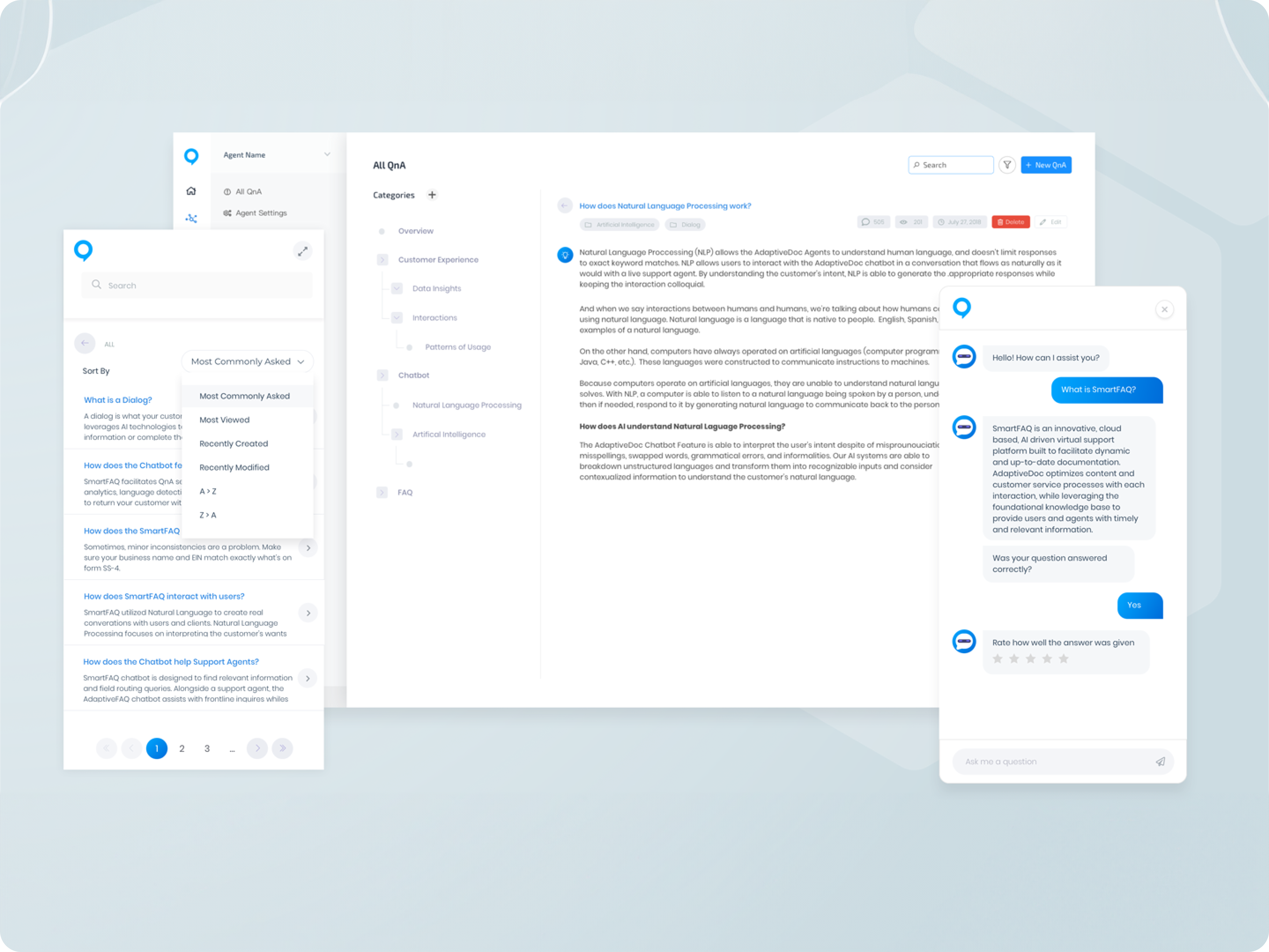
Led the design and front-end development for a pre-ChatGPT smartbot